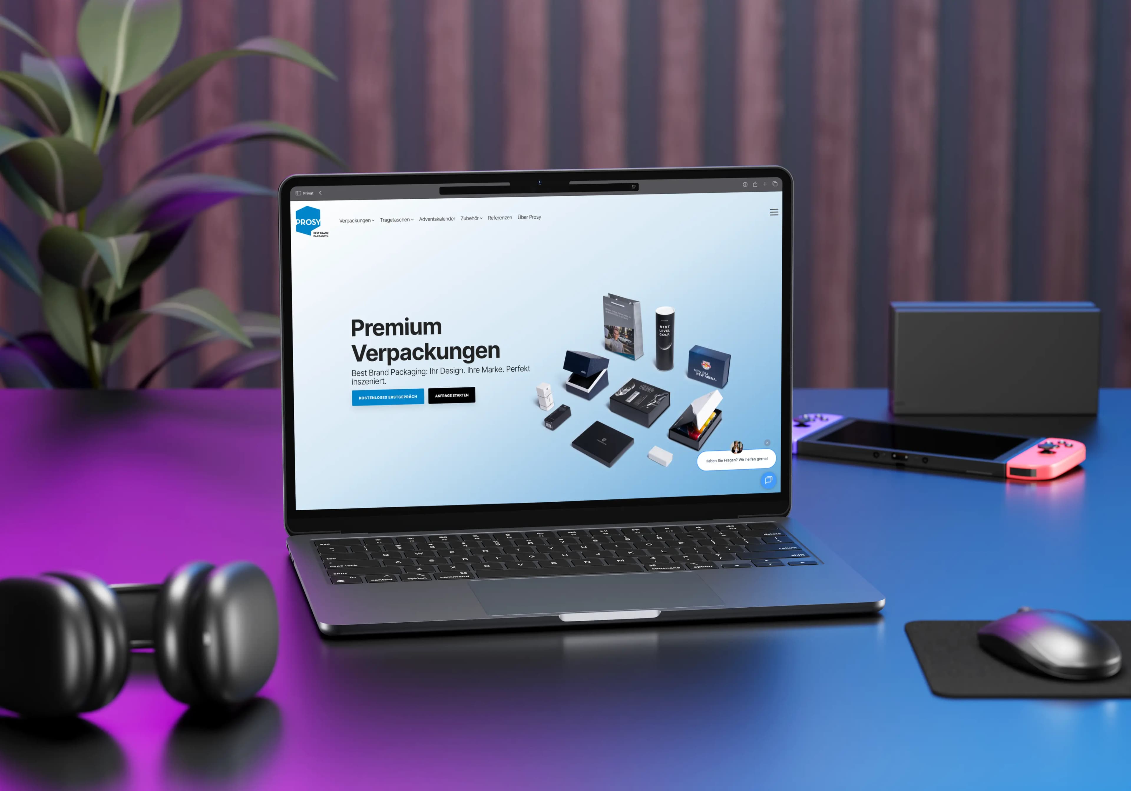
Pick up your phone, open any website, and squint until everything blurs. You can no longer read a thing. But you still see something: a dark bar at the top, a bright patch in the middle, maybe a coloured button. That is visual hierarchy. Everything else is detail.
In short
- Hierarchy is not a matter of taste but an order: what does someone see first, what second, what perhaps never?
- The levers differ in strength. Size beats everything, type weight is the weakest – and whitespace is almost always underrated.
- The most common mistake: emphasising everything. Emphasis only works in relation – something can stand out only if something else steps back.
- Three tests follow further down. Two of them you can run right here in the article.
Hierarchy is an order, not an ornament
Most people think of design as taste: nice colours, pretty type. Hierarchy has little to do with that. It answers a far more mundane question – what does someone see first, what second, what perhaps never?
The best example hangs in every station and airport concourse. On a departure board everything is the same size: same typeface, same colour, same line height, no ornament whatsoever. And still you find what you need in two seconds. The order sits entirely in the arrangement of the columns – time on the far left, then the destination, then airline and flight number, status on the far right. Nobody was thinking about aesthetics there. Somebody decided in which order a hurried person needs the information.

The counter-experiment waits for you in restaurants. Many menus set the prices flush right in a column of their own, often with a dotted leader in front. The result: the guest reads the price column top to bottom and picks the cheapest dish. Menus that put the price directly after the description instead, in the same type size, steer the eye back to the food.
Same information, different order
Price column
Main courses
The prices stand as a column of their own, stacked, flush right, all aligned. That makes them the first level, and they can be compared without reading a single dish.
Price in the line
Main courses
Veal goulash with bread dumpling 24.50
Char from the Ötztal, with herb butter 27.00
Cheese spätzle with mountain cheese and fried onions 18.50
Same price, same size, same colour, right behind the description. It loses its own track, and the eye stays on the food.
Nothing was left out or hidden. All that changed is the order in which you read it.
Same information, different order, different behaviour. That is exactly why hierarchy is a decision and not an ornament.
The levers, sorted by effect
There is a handful of tools for creating order. They differ in strength, and that is often underestimated. The list below is sorted by effect – and sets itself in exactly those weights.
Six levers, strongest first
- SizeBeats everything. An element twice as large as its neighbours wins, no matter what colour it is.
- ContrastComes right after. What matters is the difference in brightness, not the colour itself. A loud orange on red stands out less than a mid-grey element on white.
- ColourOnly works while it stays rare. Make the call-to-action coloured, and the headline too, and the notice box as well, and you have three coloured things and no emphasis left.
- PositionWeaker than many believe. A large image in the lower half of the frame beats a small line at the top with ease.
- WhitespaceThe lever beginners discover last. Distance groups: two elements close together belong together to the eye, no rule, no frame, no box required.
- Type weightBold, italic, caps: the finest tool, good for the third and fourth level. For the main accent it is too weak.
The line at the top is not more important than the one at the bottom. It is merely set larger. And that is precisely why you read it first.
One more word on position, because it is the most overrated of the six: yes, there is the F-pattern that eye-tracking studies keep finding on text-heavy pages.[1] The gaze runs right along the top, then a shorter pass, then down the left edge. But that is a pattern for pages with barely any design – as soon as a strong element enters the frame, the element wins.
And most layouts get better when you delete dividing lines and stagger the spacing cleanly instead. Whitespace costs nothing but nerve.
The mistake almost everyone makes
Everything is important. The headline is bold, the subtitle too, the offer is set in caps, next to it a coloured flash, below it three buttons of equal size. The client said it all had to stand out, and the designer duly delivered.
The same message, twice
Everything emphasised
New!
Change your winter tyres now
Appointment within 24 hours, no waiting
Mon–Fri 7:30–18:00
Five elements compete for the same rank. The eye finds no way in and starts jumping.
One first-order element
Change your winter tyres now
Appointment within 24 hours, no waiting
The same words, the same area. All that stepped back is what is allowed to be second level.
When everything shouts, you hear nothing.
Emphasis only works in relation – something can stand out only if something else steps back. That is not a matter of taste, that is physiology.
Two rules of thumb
- 1
One first-order element per screen
One. Not two equals for the eye to swing between.
- 2
Three levels are enough
Four are rarely necessary, five nobody can tell apart any more.
And yes, that sometimes means explaining to the client why the logo is getting smaller.
A worked example
A poster for an author reading. It has to carry: the author's name, the book title, the date, the time, the venue, the admission price, the organiser's logo, and a portrait photo. Eight pieces of information, all of them necessary.
The typical draft stacks everything neatly, all roughly the same size, logo at the bottom. You can read it. It does not stand out.
Better: the portrait takes two thirds of the surface – faces pull the eye more reliably than text does. The author's name goes large, because people come for the name, not for the book title. Date and venue form a block together, clearly set off, medium-sized. The rest – time, price, logo – drops into a small line at the bottom, all at one size.
Eight pieces of information, three levels
First level
Portrait,
author name
What still lands from ten metres away.
Second level
Book title,
date, venue
Gets read once somebody has stopped walking.
Third level
Time, price, logo
Gets looked up once the decision has been made.
Eight equal pieces of information became three levels. Nothing was deleted.
Three tests that together take under a minute
The squint test and the greyscale test
Squint, or run the image through a heavy blur. Whatever is still recognisable as a shape is your first level. If there is nothing there, or five things at once – problem found.
The greyscale test works differently: colour out, everything in black and white. Does the order still hold? If not, your layout hangs on colour alone, and it will collapse at the latest on a black-and-white printout or for readers with red-green colour blindness. The accessibility guidelines ask for exactly this, by the way: colour must never be the only means of conveying something.[2]
You can try both right here. On the left the poster from above as a typical draft, on the right the same one in three levels:
Test lab
Typical draft
Reading
Marta Kern
The Silence After
November 14
7:30 pm
City Library Innsbruck
Admission 12 €
Kulturverein Nord
Eight pieces of information, all roughly the same size, evenly spread.
Three levels
Marta Kern
The Silence After
November 14
City Library Innsbruck
7:30 pm · Admission 12 € · Kulturverein Nord
The same eight pieces of information, weighted by order.
Switch to “Squint”: on the left a grey carpet of stripes remains, on the right the face and the name stay standing. In greyscale the right-hand order holds as well. It does not hang on colour.
The five-second test
Show somebody the draft for five seconds, then take it away and ask: what do you remember? The answer is your actual hierarchy, not the one you intended. The test hurts sometimes, and that is exactly why it is worth running.
Five-second test
Ready? The poster appears for five seconds and then disappears again. Do not prepare, just look.
A postscript that often gets forgotten
Optical hierarchy is not the same as structural hierarchy. A paragraph you scale up to 32 pixels looks like a heading – to a screen reader it stays an ordinary paragraph.
Looks like a heading
<p style="font-size: 32px">
  Our services
</p>
Screen reader announces: paragraph. In the document structure this level does not exist.
Is a heading
<h2>
  Our services
</h2>
Screen reader announces: heading level 2. The level can be jumped to and skimmed.
So anyone working on the web should build the order twice: visibly through size and spacing, invisibly through H1, H2, H3.[3] When both orders agree, the layout is usually clean in other respects too.
To close, the exercise from the beginning, the other way round: squint at your own most recent draft. What stays standing?
If that is the thing that should stay standing, you are done.
We build exactly this order into websites – visible and structural. If you want to know what lands first on your page, have a look at our UI/UX design or drop us a line.
Sources
- [1]Nielsen Norman Group, F-Shaped Pattern of Reading on the Web – eye-tracking analysis of reading behaviour on text pages. nngroup.com
- [2]W3C, WCAG 2.2 – Success Criterion 1.4.1 Use of Color. w3.org
- [3]W3C, WCAG 2.2 – Success Criterion 1.3.1 Info and Relationships. w3.org